CECOApp
Mobile E-commerce
Designing the first mobile app for Cecotec — a home appliances brand with €510M in annual sales and zero mobile presence.
€510M
Annual Sales (No App)
7
Usability Testers
4
Product Pillars
3
User Personas
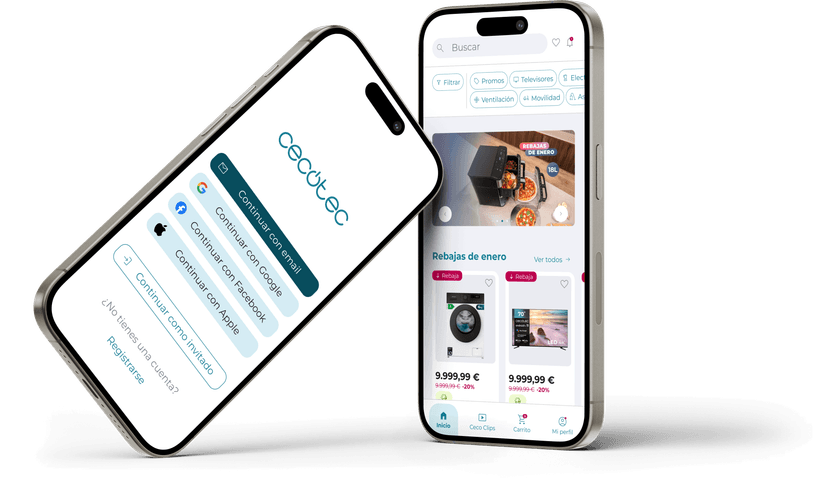
Closing the mobile gap for a €510M brand
€510M in annual sales with zero mobile presence. M-commerce was already the dominant channel — Cecotec had no way to reach users on mobile.
The Challenge
“How do you design a first mobile app that doesn't just replicate the web — but builds active loyalty with the user?”
Results
A validated, dev-ready prototype grounded in real user behavior — not web assumptions.
0
Unresolved Frictions
Every hierarchy, accessibility, and CTA issue resolved before delivery.
7
Usability Testers
Validated across all 3 personas — purchase, tracking, search, and CecoClips.
4
Validated Flows
Purchase, tracking, search, CecoClips — dev-ready with Atomic Design system.
Key insight: Card sorting showed mobile users group by lifestyle context — so the entire IA was rebuilt from scratch rather than copied from the web.
Four phases, one validated prototype
Discovery
- Surveys and semi-structured interviews to map user behavior, purchase motivations, and pain points
- Analysis of Cecotec web user journeys to identify mobile-specific value moments
- Mapped the purchase cycle to find where a mobile app creates unique value over the web
Output
Mobile app adds unique value in reordering, tracking, and loyalty — not just a web port.
Definition
- Benchmarking against leading e-commerce apps (Amazon, Zalando, Leroy Merlin)
- Non-moderated card sorting: 3 groupings emerged — Home & Appliances, Fitness & Personal Care, Home Maintenance
- Definition of 3 user personas: Ejecutiva Exigente, Comprador Técnico, Usuario Tradicional
- Feature prioritization matrix balancing user need, business value, and technical effort
Output
IA validated against real mental models — 3 card-sorted navigation categories, not replicated from the web.
Development
- Low-fidelity wireframes for all primary flows
- Atomic Design system: Atoms → Molecules → Organisms → Templates → Pages
- High-fidelity prototype covering all 4 product pillars
- Accessibility and visual hierarchy review across all screens
Output
Complete high-fidelity prototype covering purchase, tracking, and CecoClips flows — ready for validation.
Delivery
- Moderated usability test with 7 participants across all 3 personas
- Friction in hierarchy, accessibility, and key action prioritization — all resolved before delivery
- Final Atomic Design system with annotated specs for development handoff
Output
All identified frictions resolved before delivery. Zero open issues at handoff.
Three profiles, one consistent experience
3 distinct personas drove every design decision — from tap target size to navigation depth.
Ejecutiva Exigente
Busy professional. Judges the app by how fast she can reorder or track a delivery.
Priorities
Comprador Técnico
Researches before buying. Needs complete specs, reviews, and comparison tools.
Priorities
Usuario Tradicional
Less experienced with mobile. Needs large tap targets, simple navigation, no surprises.
Priorities
CECOApp — four pillars
Structured around four core pillars addressing the full lifecycle from discovery through community.
Product Discovery
Personalized home feed, card-sorted category browsing, and smart search with filters.
Simple & Efficient Purchase
Streamlined checkout, saved addresses and payment methods, one-tap reorder.
Real-Time Order Tracking
Live status, estimated delivery, push notifications. No need to contact support.
CecoClips
Short videos from real users showing products in use. Built for retention and loyalty.
What we didn't choose
Replicating the web structure was the fastest path — and was explicitly rejected.
Card sorting showed mobile mental models differ from desktop. Clarity over consistency.
Discarded
Mirror the existing Cecotec web navigation structure for the mobile app architecture.
Chosen
Design IA from scratch based on 3 groupings from non-moderated card sorting with real users.
Why it mattered: Mobile users browse by lifestyle context, not product taxonomy. The web was optimized for SEO — not for how people think.
All screens
Key learnings
Mobile-first means redesigning around the mental model shift that happens when users pick up their phone. Not making things smaller — making them different.
The most important research method was card sorting, not interviews. Users couldn't articulate how they wanted to navigate — but the sort data showed it clearly.
Data beats assumptions about navigation
Card sorting with real users produced 3 clear groupings that contradicted the existing web taxonomy — and became the entire IA.
Usability testing is not optional
7 participants across 3 personas found real friction in hierarchy and CTAs. Those fixes made the difference between a prototype and a usable product.
CecoClips was the loyalty differentiator
Short videos from real users create reasons to return that a product catalog alone can't generate.
Atomic Design pays off at handoff
Building from atoms up meant the design system was the handoff document — no extra annotation needed.
Explore the interactive prototype
Complete flows, design system, and annotated specs — live on Figma.