Art City Tour
Navigation App
Real-time navigation app for Art City Tour — a nocturnal cultural event in San José where visitors move between art venues in shuttle buses. Designed for orientation, transport tracking, and friend coordination without cognitive overload.
15
Paper Prototype Users
3
User Personas
6
Apps Analyzed
WCAG
AA – AAA Contrast
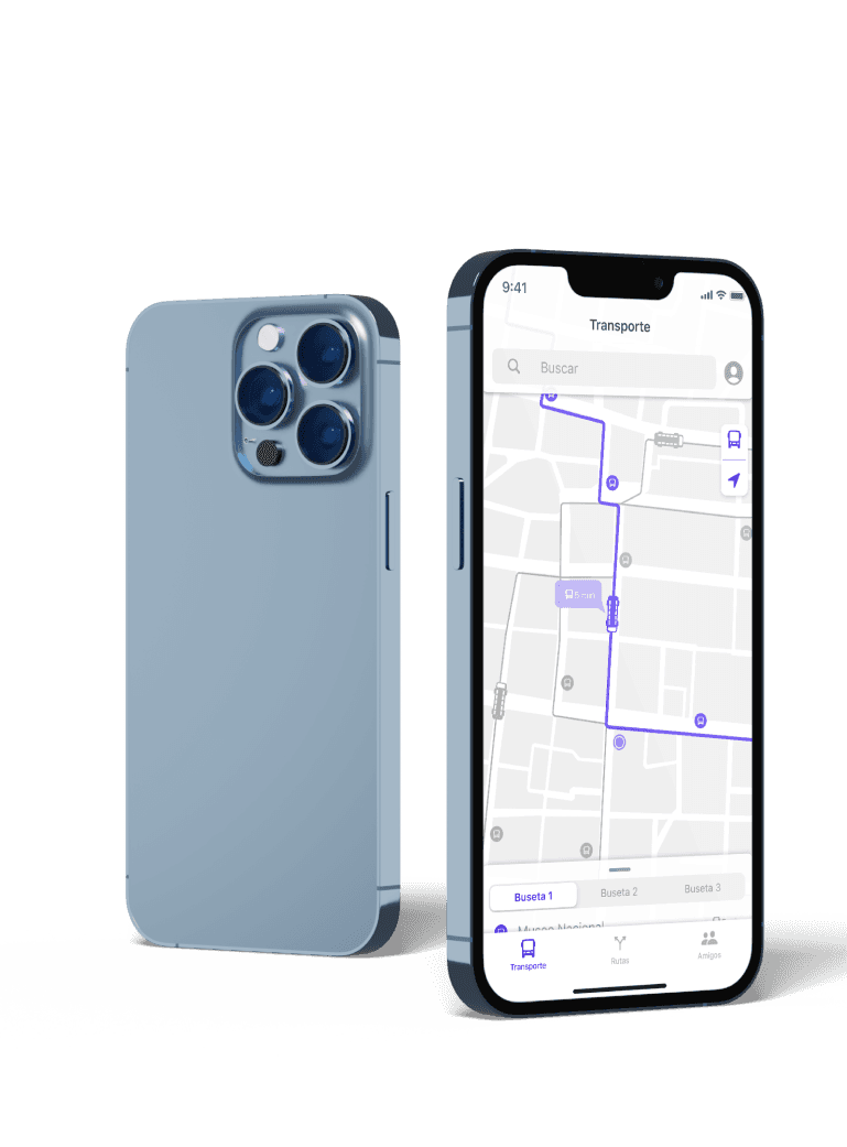
A nocturnal event with no
real-time navigation
Art City Tour is a nocturnal cultural event in San José — visitors move between venues on shuttle buses. No quick access to bus info, routes, or real-time location.
The Challenge
“How do you design an app for orientation, transport, and social connection during a dynamic nocturnal event — without cognitively overloading a user who is in constant motion?”
Event Context
Art City Tour — San José, Costa Rica
Nocturnal cultural event · Shuttle buses · Multiple venues
Academic Project · TEC Escuela de Diseño Industrial
Design System
Results
0
Task Failures (High-Frequency)
Bus stop, directions, bus times — zero failures across all paper prototype sessions.
1
Tap — Critical Tasks
Bus stop and preset route — single tap from home state.
AA+
Accessibility Level
All tested contrast pairs meet WCAG AA minimum. Primary text achieves AAA (7.39:1). Designed for low-light legibility.
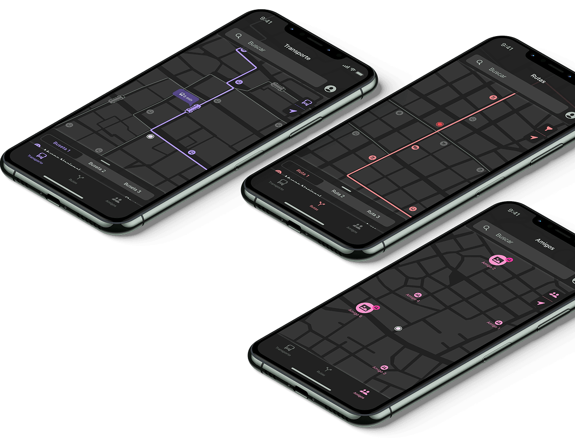
Research, planning, and validated UI
Research
- Analyzed 6 existing map applications using a 20-feature complexity scoring system
- Defined 3 user personas with representation percentages from survey data
- Traffic analysis via surveys: bus stop locator (18%), bus times (17%), and directions (15%) represent 80% of expected usage
Output
Transport and navigation = 80% of expected usage. Low-frequency features (3–4%) identified for de-prioritized placement.
Key Insight
80% of expected usage was transport and navigation — bus stop locator (18%), bus times (17%), and directions (15%) combined. That single number drove the entire information architecture.
Planning
- Card sorting to validate terminology and information architecture
- Navigation paths analysis — critical tasks reduced to maximum 1 action
- Paper prototyping with 15 users — identified 2 iconography issues (filter icon confused with settings, replaced following iOS/Android conventions)
Output
Alpha architecture validated. Critical tasks reduced to maximum 1 action. Paper prototyping identified 2 iconography issues — both resolved before UI design phase.
UI Design
- Complete design system on SF Pro typography and SF Symbols — monochromatic color scheme (one accent per section)
- Dark background optimized for nighttime use; photography direction shows venues with human activity
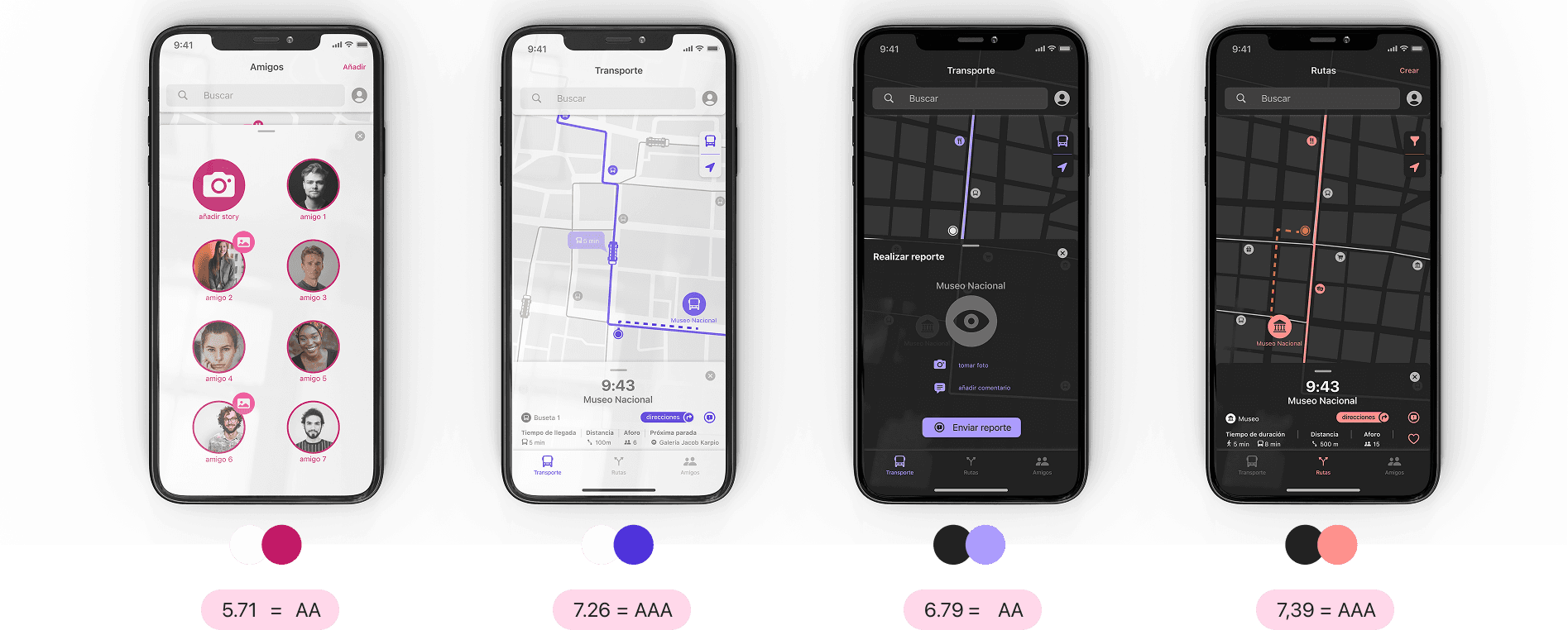
- WCAG accessibility validation — contrast ratios between 5.71 (AA) and 7.39 (AAA) across all screens
Output
Complete design system, validated accessibility. All high-frequency tasks — one tap. Dark UI optimized for nighttime use.
Three personas — validated by survey
Representation percentages derived from survey data. Design decisions on density, navigation depth, and social features were weighted by persona distribution.
La Pelotera
The majority. Came for the social experience — finds friends, discovers nearby events, moves spontaneously.
Key Needs
La Ordenada
Plans ahead. Arrives with a schedule, wants to know exact bus times and routes before moving. Frustration tolerance is low.
Key Needs
El Desubicado
Lost from the start. Needs large tap targets, simple language, and immediate wayfinding.
Key Needs
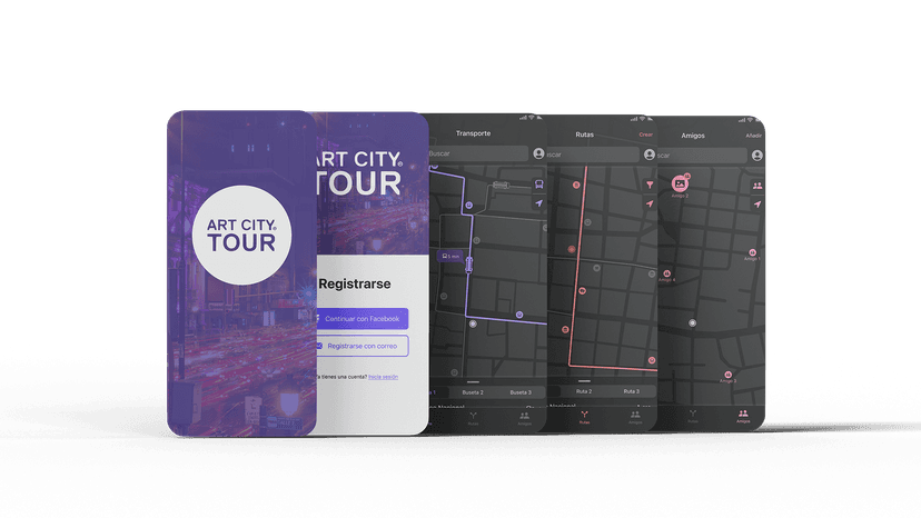
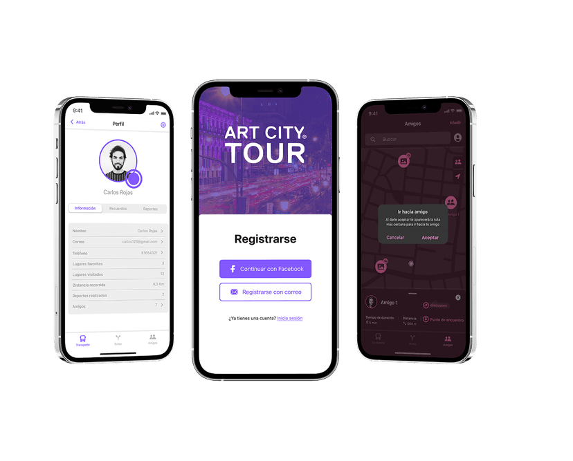
Three sections, one tap away
The app is structured around 3 primary sections accessible from a bottom tab bar. Every high-frequency task is reachable in a single tap from the home screen.
Transport
Real-time location of shuttle buses and stops. The highest-traffic feature — accounts for 35% of expected usage. One tap to see the nearest bus stop.
- Live bus positions
- Stop list with distance
- Arrival time estimates
- Route for each bus
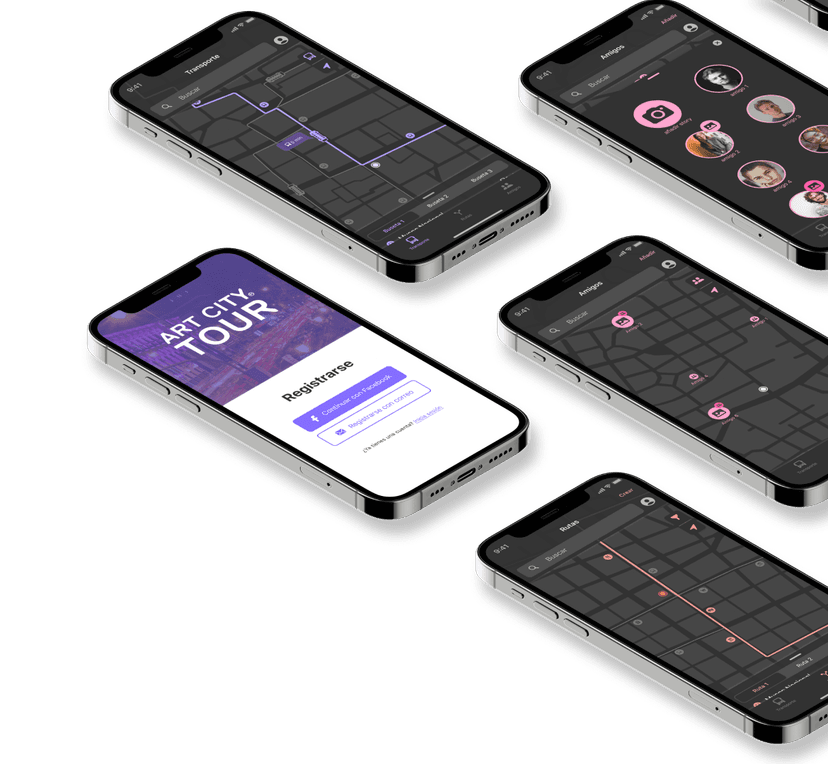
Routes
Preset and custom routes between venues. Directions from current location. Second-highest traffic cluster at 15% of expected usage.
- Preset venue routes
- Custom route builder
- Turn-by-turn directions
- Walking distance + time
Friends
Real-time location and coordination with other attendees. Built for La Pelotera — the majority persona at 59%.
- Friend location on map
- Meetup suggestions
- Group coordination
- In-app messaging
Design System
Typography
SF Pro — Apple's system font. Chosen for legibility on small screens in low-light conditions, with extensive real-world validation across iOS apps.
Iconography
SF Symbols — leverages established iOS mental models. Users recognize navigation patterns from apps they already use daily, reducing the learning curve.
Color per Section
WCAG validated — AA to AAA
Contrast Ratios
Why dark UI
Nighttime event. Dark UI reduces glare, preserves night vision, and makes colored accents pop — improving wayfinding speed in context.
Photography direction
Venues shown with people and activity — not empty interiors. Helps users recognize a venue from a distance.
What we didn't choose
Reporting (3%), favorites (3%), venue capacity (4%) = 20% of usage. Desirable — but not primary.
Cluttering the interface for a user in motion was not an option. All included — but de-prioritized to secondary actions.
Discarded — Primary prominence
Chosen — Primary prominence
Icon change after paper prototype
Original filter icon confused with settings by prototype testers. Replaced with the iOS/Android convention — evidence, not preference.
What this project taught me
Designing for a live event — with real motion, low light, and no second chances — forced decisions that purely studio-based projects rarely demand.
Usage data drives architecture
80% of expected usage in 3 features. That number justified every IA decision — the bottom tab bar, one-tap critical tasks, secondary features buried. Without data, those decisions are preferences.
Paper prototyping is the cheapest test
15 users, 2 icon problems caught before any high-fidelity design. The filter icon fix took minutes with paper. In production it would have been a sprint.
Context is a design constraint
Nighttime, movement, noise, social distraction — these are real constraints, not edge cases. Dark UI, SF Pro, and high contrast were engineering choices before they were aesthetic ones.
Accessibility validates design quality
WCAG AA–AAA was a consequence of good decisions, not a separate checklist. When contrast ratios pass at 7.39:1 for a dark event app, it means the design works for everyone — not just ideal conditions.
See the full project
Interactive prototype live on Figma · Screens on Behance.