SJO Turismo
App Redesign
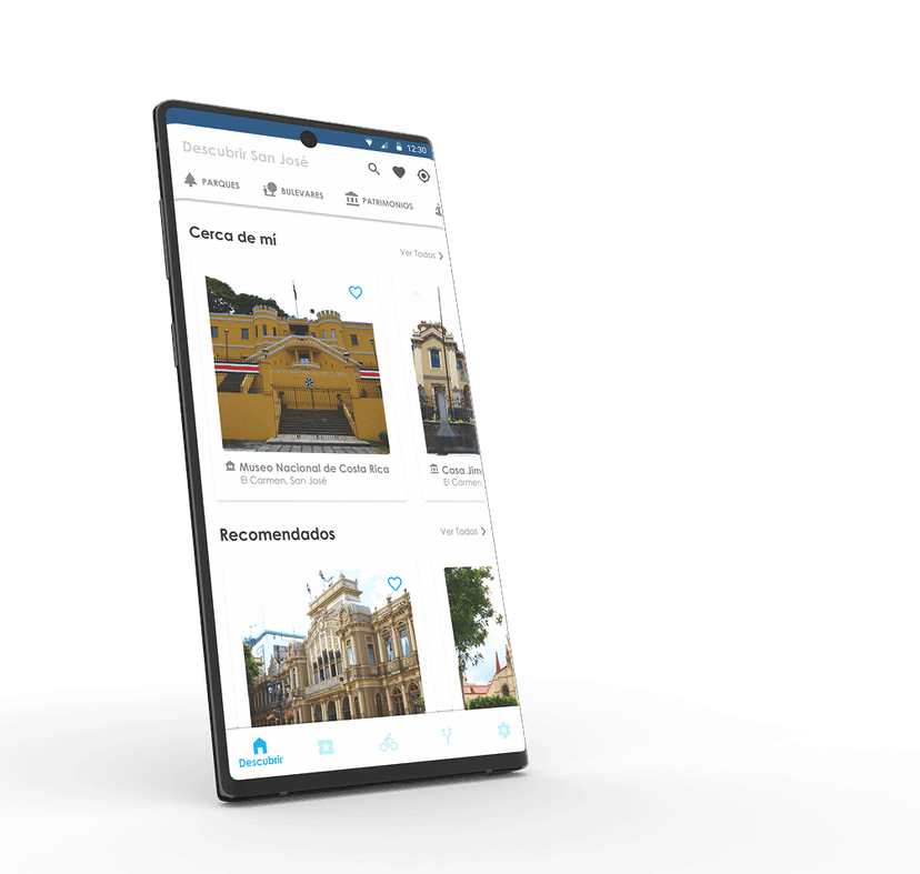
UX redesign of the SJO Turismo app for the Centro Histórico de San José — a collaboration between the Instituto Tecnológico de Costa Rica and the Municipalidad de San José.
3
Design Stages
120
Survey Responses
10
Usability Testers
2
Semesters
Redesigning the city's cultural compass
The Municipalidad de San José had an existing APK to help visitors navigate the historic center — museums, theaters, parks, and cultural events. But usability problems made it harder to use than not having it at all.
Team
José Pablo Campos
UX/UI Designer
Felipe Víctor Benavides
UX/UI Designer
Maria del Carmen Valverde Solano
Professor Advisor
Institution
Instituto Tecnológico de Costa Rica (TEC)
Escuela de Diseño Industrial · Special Assistantship — I & II Semester 2021
Client
Municipalidad de San José
Centro Histórico de San José, Costa Rica
Tools
APK vs. Prototype — task performance
Participants who tested the original APK were retested on the new prototype. All tasks showed meaningful time reductions.
Downloading the Museos route dropped from 2 min 44 sec to 1 min 9 sec — a 58% improvement on a single task.
−58%
Best task improvement
Download Museos route
−46%
Find Museo Nacional
24 sec → 13 sec
Worst APK case
6 min 25 sec
Finding Museo Nacional when the user accidentally navigated to the map — unable to locate the information there.
Three stages, one validated design
Diagnosis APK
- Google Forms survey to validate functionalities (added Favorites; removed low-demand Tour Operators)
- Usability tests with 10 participants on the existing APK — problems in Design Patterns, Interaction Flow, and UX
- Feature definition workshops with the municipality team and legal scope review
- Arquitectura Alfa: all content organized into 5 sections — Descubrir, Actividades, Rutas, Movilidad, Ajustes
Result
Arquitectura Alfa — 5 sections validated via user-assigned associations.
Pattern Hunting & Proposal
- Competitive analysis for dominant design patterns in urban tourism apps
- Applied Atomic Design (Atoms → Molecules → Organisms → Templates → Pages)
- Material Design nav bar with 5 tabs; celeste as primary interactive color from the Centro Histórico brand book
- High-fidelity prototype for all 5 sections
Result
High-fidelity interactive prototype ready for validation.
Usability Testing & Validation
- Heuristic usability tests comparing task times: original APK vs. new prototype
- 120-response survey to prioritize categories; 93-participant icon validation for "Rutas"
- Figma Design System and prototype delivered to the computing team on June 24 for SCRUM development
Result
Task time reductions across all tasks. Design system handed off for SCRUM development.
Atomic Design + Material Design
Methodology
Atomic Design
Atoms (colors, type, icons) → Molecules (buttons, cards) → Organisms → Templates → Pages.
Color System
Based on the Centro Histórico brand book + Material Design proportions. Celeste applied exclusively to interactive elements.
Primary (Celeste)
Interactive elements, active states
Secondary (Navy)
Headers, navigation bar
Text Gray
General body text
Inactive Gray
Leading icons, input borders
App Background
Main surface — light, minimal
Content category ranking
85.8% ranked museums as their top category — the clear anchor for "Descubrir."
120 participants rated each category 1–5. Results drove the navigation order within "Descubrir."
Route icon recognition
42% recognized the original fork icon — the highest score, so it was kept unchanged.
93 participants tested 5 icon options for the "Rutas" tab.
Fork/route split (original)
42%
Navigation arrow
28%
Map pin
12%
Bidirectional arrows
9.5%
Bookmark / open book
8.5%
Decision: Original icon retained with 42% recognition — highest score among alternatives.
From design to development
The validated design was handed off to a computing team (Scrum Master: Alonso Obando) for SCRUM implementation.
Stage 01
- Storyboard for onboarding flow
- Requirements list with development team
- Developer-ready asset preparation
- Progress follow-up
Stage 02
- Second APK version validation
- UX review of implemented screens
- Progress follow-up meetings
Stage 03
- Correction iterations
- Design system documentation for future designers
- Progress follow-up
- Official launch
Key learnings
Testing against a real baseline made it possible to quantify design impact — not just describe it. Task times dropped by up to 58%.
Legal constraints on private venues required stakeholder negotiation and mid-project IA pivots — institutional design requires flexibility.
Atomic Design from the start meant the handoff was a self-documenting Design System — specification and reference guide in one Figma file.
Quantified impact
APK baseline made improvements measurable — not just perceived. Up to 58% task time reduction.
Stakeholder navigation
Legal constraints on private venues forced mid-project IA pivots. Institutional design requires flexibility.
Data-driven decisions
120-person survey and 93-person icon test replaced assumptions with evidence.
Design system as handoff doc
Building with Atomic Design meant the system was its own documentation — no extra annotation needed.
All screens
See the full design
Interactive prototype live on Figma.